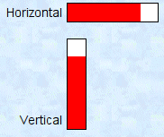
Bar and Setbar Widgets
 |
 |
    |
Both these widgets look the same and have the same parameters. The bar widget is passive and simply displays values graphically relative to a fixed minimum and maximum. The setbar widget will set the value of the associated data element to a value determined by where the bar is clicked. In both cases,there is no numeric value displayed. If a numeric value is desired, place a text widget adjacent to the bar or setbar widget.
Bar graphs have a specified height and width. If the width is greater than the height, then the bar graph is horizontal, increasing to the right. If the height is greater than the width, then the bar is displayed vertically with values increasing upwards.
There are four options for this type of widget in the Custom GUI menu bar: Bar, Vertical Bar, Setbar, and Vertical Setbar. The horizontal and vertical versions of each type of bar function identically, and you can convert an existing bar from one orientation to the other; these options are just for convenience.
Besides the normal five required parameters, the bar widget has seven additional parameters. The first five are required.
| Parameter | Value in Example | Description | If Not Present | Default |
|---|---|---|---|---|
| Height | 20 | Bar height in pixels | Required | 20 (100 for vertical) |
| Width | 100 | Bar width in pixels | Required | 100 (20 for vertical) |
| Minimum | 0 | Minimum scale value | Required | 0 |
| Maximum | 200 | Maximum scale value | Required | 100 |
| Bar Color | red | Color for the bar | Required | Green (blue for setbar) |
| Background Color | white | Color for the background | Transparent | Lightgreen (lightblue for setbar) |
| Label Text | Horizontal | Label text to be displayed to left of widget | No label | Bar, Vertical Bar, Setbar, or Vertical Setbar |
