Vermont Energy Control Systems

Practical monitoring and control for the real world

Custom Graphical User Interface | Vermont Energy Control Systems

Vermont Energy Control Systems

Practical monitoring and control for the real world

Graphical User Interface

Introduction

This document is a guide to using and creating Graphical User Interfaces (GUIs) for the Vesta monitoring and control system.

Terminology

There are several terms that have specific meanings in this document:

  • GUI: Graphical User Interface. In this document, a web page that is live so that data is continuously updated. It may also allow user interaction, such as setting values or turning things on or off.
  • Data Element: Any input, output, or variable in a Vesta unit.
  • Widget: A graphical representation of an indicator light, gauge, bar graph or other object. Widgets are connected to Vesta data elements, and are placed on a background image to create a custom GUI.

Vesta Web Interfaces

Out of the box, Vesta provides a simple web-based user interface that's used to set up and program the system:

Screenshot of default user interface

Figure 1: Standard Web Interface (Vantage & Pro: Classic is similar)

This interface allows creation of data elements, creation and editing of rules, monitoring of all inputs and outputs, and a variety of system management functions.

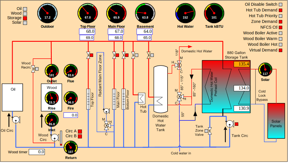
In addition to this simple web interface, the Vesta controller has the ability for users to create a customized graphical user interface (GUI) that's more relevant to their needs. This interface updates automatically and provides the ability to directly set Vesta internal elements (variables and outputs). The interface supports a variety of graphical elements (widgets) and allows them to be placed arbitrarily on an image background of the user's choice.
Screenshot of a customized web interface

Figure 2: Custom Web Interface

In the example above, a variety of display widgets were placed on top of a system plumbing schematic.

By default, all widgets update every 5 seconds. That means that dial pointers move, digital displays refresh, and indicators change color automatically. This is done 'behind the scenes' so the page doesn't have to be refreshed.

In addition to real-time display, some widgets allow interaction. For instance, a widget can be defined which will set or toggle a discrete output on Vesta. A numeric display widget can also allow the value to be changed, and set an Vesta variable to the new value.

On newer Vestas, all widgets and other aspects of a custom GUI page can be easily maintained using Edit Mode. On older Vestas, creating and modifying this interface requires some familiarity with web pages and web server terminology.

Vesta Address Used In Examples

Throughout this document, examples assume that your controller is at the standard address of 192.168.1.8. Change as necessary to match your configuration.

Custom Graphical User Interface | Vermont Energy Control Systems

Vermont Energy Control Systems

Practical monitoring and control for the real world

Software Architecture

Creating A New Custom GUI

While newer Vestas can create new GUI pages through Edit Mode, to create a custom page on older Vestas, the user needs to do the following:

  1. Create a new skeletal HTML file
  2. Create a new empty text file
  3. Create and upload a background image file if desired

These steps require the use of command-line tools or FTP. Detailed instructions are contained in this manual.

Once the required files are in place, 'widgets' are created by adding lines to the text file. On older Vesta units, this is a manual process. On newer Vestas, the Edit Mode tools allow drag-and-drop creation and editing of all widget attributes.

Under The Hood

This interface is based on AJAX and SVG (Scalable Vector Graphics). It works with Google's Chrome browser, Firefox, and Safari (including iPhone). At present, it does not work with Internet Explorer or with some Android browsers.

The User Defined Interface is composed of multiple parts. All the components can be on Vesta, or they can reside on different web servers. The key components are as follows:

  1. A skeletal HTML file loaded by the user's browser. This file provides the framework for the page. This HTML file in turn loads:
  2. Javascript files containing the widget code and other function libraries. When the Javascript is all loaded, it in turn performs an initialization, which loads:
  3. A text file containing definitions for all of the desired widgets
  4. Optionally, a background image

All required files are delivered with the system.

Default Pages: Vesta Classic

In the Vesta Classic, there are two default GUI pages that are built automatically by the system. Both display all system inputs, outputs, and variables. One is intended for 'internal' use - that is, use by the system owner. It allows the user to set any output or variable in the system. The other version is intended for 'external' use - perhaps to be displayed to the outside world. The public version is read-only.

Screenshot of the auto-generated private version of a customized web interface

Figure 3: Vesta Classic Custom Web Interface, Auto-Generated Private Version

The above example allows the user to set any outputs or variables. The 'GUI Button' can be toggled by clicking on it, for instance.

The password-protected private version is at http://192.168.1.8/private/index.html, while the public version is at http://192.168.1.8/public/index.html.

There are links to both on the Home Page of the standard web interface.

Vesta Vantage and Pro

In the Vesta Vantage and Pro, the built-in 'Elements & Rules' tab is a live interactive custom GUI that's built automatically by the system. Documentation for this tab is in the User Manual.

Screenshot of the live Elements & Rules tab

Figure 4: Vesta Vantage and Pro live Elements & Rules tab

Custom Graphical User Interface | Vermont Energy Control Systems

Vermont Energy Control Systems

Practical monitoring and control for the real world

HTML File

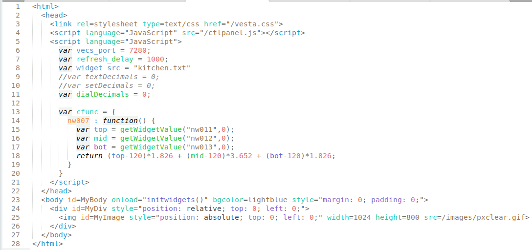
The HTML file contains references to the files and the background image. It also contains variable definitions that will be discussed below. A typical HTML file would look like the following:

Screenshot of the HTML file for a custom page

Figure 4: HTML File for custom page

This is one of two files that MUST be edited by the user, either directly or using Edit Mode, to create a user interface. If it's hosted on Vesta, then it should be in either the public or private directories (/var/www/public/ and /var/www/public/ respectively). We'll go through it line by line.

Lines 1 through 5 contain references to CSS and Javascript source files. Don't change these lines.

Line 6 contains the TCP port number for communication with Vesta. It should be 7280 unless you have changed the Vesta's default behavior.

Line 7 specifies the delay between updates of the widgets in the interface. The delay is in milliseconds, so a value of 1000 means that all the widgets will update once every second. If you have a lot of widgets (50 or more) specifying too small a delay can overload the Vesta controller. This can cause delayed rule execution. A good rule of thumb is to take the number of widgets and multiply by 5 to get the minimum delay in milliseconds. For a display with 50 widgets like the example above, the delay should be about 50 * 5, or 250 milliseconds. With this delay on the standard CPU, a single display instance on a single browser will use about 4% of CPU capacity. This allows several instances (iPad, Smart Phone, Computer in den) to be updated simultaneously without affecting system performance. At total rates above 1000 widget updates per second, system performance may start to be affected.

NOTE: If you are running an older version of the system software (earlier than 2.0.1451), then you need to use much longer delays. Multiply the number of widgets by 50 rather than 5 to get the minimum delay. With the older software, a 50-widget display should have a delay of at least 2500 milliseconds.

Line 8 specifies the widget configuration file - in this case, "kitchen.txt". This file contains a list of widgets to be displayed. In addition to the HTML file, this file must be created by the user. Note that this file must be in the same directory as the .html file, and that the full path must not be included in the file name (/public/kitchen.txt would not be valid, for instance).

Lines 9 through 11 specify the number of decimal places for 'text', 'set', and 'dial' widgets respectively. The default if not specified is 1 decimal place. the double slash // in lines 9 and 10 turns the line into a comment that's ignored by the system, so text and set widgets will display 1 decimal place in this example.

Note that these settings affect all widgets of a given type. There's no way to have some dials display 1 decimal place and others display 2, for instance.

Lines 13 through 20 contain code for a custom function. This feature will be described below.

Line 25 contains the background image - in this case, "/images/pxclear.gif". This line is required, and must specify a valid image. The size of the image defines the area available for display widgets. The image can reside anywhere as long as the browser can access and display it. The Vesta is distributed with a single pixel transparent image that can be used as in this case. instead. If using the transparent pixel image, the width and height must be specified as shown.

Custom Functions

In some cases it may be useful to display a value that's calculated from other values. The Vesta custom GUI supports this through the creation of 'custom functions'. A custom function is associated with a specic widget, and is written using JavaScript. In the example above there's a widget that displays total heat available in a storage tank. That heat is calculated from the temperatures at the top, middle, and bottom of the tank. There are four widgets involved:

  • nw007: the widget that will display the total heat available
  • nw011: a widget displaying the tank top temperature
  • nw012: a widget displaying the tank middle temperature
  • nw013: a widget displaying the tank bottom temperature

Widget IDs can be obtained by right-clicking on the widget in edit mode. Note that adding or deleting widgets may change the ids.

A custom function is defined for widget nw007 in lines 13-20 above.

Line 13 begins custom function declarations. Do not edit this line.

Line 14 begins the custom function for widget nw007. If custom functions are defined for other widgets, they would begin after the nw007 function (after line 19).

Lines 15-17 use the getWidgetValue() function to read the value of widgets nw011 through nw013. The second parameter is required and is the default value to be used if the widget can't be read.

Lines 18 performs the necessary calculation to convert temperatures to BTUs. Note that custom functions can perform any calculation on any data that's available to JavaScript, as long as it returns a numeric value.

Custom Graphical User Interface | Vermont Energy Control Systems

Vermont Energy Control Systems

Practical monitoring and control for the real world

Widget Configuration File

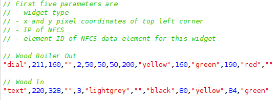
The widget configuration file is a plain text file that contains a series of one-line widget definitions as well as optional comments. It can be created and edited with any text editor. If you have a newer Vantage or Pro system, it is automatically edited by the Edit Mode tools. A portion of a widget configuration file might look like this:

Screenshot ot the widget configuration file

Comments are C++ style (double slash). Blank lines are allowed. Each widget definition takes a single line.

Widget Definitions

There are several widget types, all with different capabilities and options. Widget definitions specify the type of widget and a list of parameters that determine details of appearance and behavior.

One key specification is widget position. Widget position is specified in pixels from the left edge and top edge of the page. In most cases, the specified point will be the top left corner of the widget.

In the Vesta controller, all inputs, outputs, and variables are collectively known as data elements. Any active widget must be connected to an Vesta data element. This is accomplished by specifying the ID number of the desired data element. Element ID numbers can be obtained by going to the Vesta 'System' tab. Near the bottom is a list of files. Click on 'elements_v2.csv' and print the resulting page (or right-click and download into a spreadsheet). For each element, the element ID is the number at the beginning of the line. In the excerpt below, the element ID for 'Wood In' is 3.

    "Element","owner","physio","p/v/c","io","value","name"
    0,0,0,"c","i",1,"TRUE"
    1,0,0,"c","i",0,"FALSE"
    2,1,0,"p","i",166.299530,"Wood Out"
    3,1,1,"p","i",147.707291,"Wood In"
        

Required Parameters

The first five parameters are required, and are the same for every widget type:

  1. Widget Type - quoted text. Must be a valid widget type
  2. Left Pixel coordinate - numeric. Left edge position of this widget
  3. Top Pixel coordinate - numeric. Top edge position of this widget
  4. Vesta IP address - quoted text. Enter an empty quoted string (pair of double quotes) to use the default from the HTML file
  5. Element ID - the ID number of the element that this widget is connected to

Consider this widget definition from the example above:

"text",220,328,"",3,"lightgrey","","black",80,"yellow",84,"green"
        

This defines a widget of type "text". It's top left corner is 220 pixels from the left edge and 328 pixels from the top edge of the page. The double quotes in the next position indicate that it's connected to the default Vesta. Finally, it's connected to element 3. The additional parameters specify characteristics that are specific to 'text' widgets.

Optional Parameters

In almost all cases, any parameters after the first five are optional. Optional parameters can be left out and the widget will still display and function. However, parameters are position-specific. If you want to skip the sixth and seventh parameters but specify a value for the eighth, you must use a pair of quotes as a placeholder for each empty parameter. In the example above, the seventh parameter (border style) is left blank. The widgets section will discuss optional parameters for each widget type.

Custom Graphical User Interface | Vermont Energy Control Systems

Vermont Energy Control Systems

Practical monitoring and control for the real world

Edit Mode

In earlier systems, the widget text file was maintained manually using a text editor, as described in previous sections of this document. Newer Vantage and Pro systems have tools that greatly simplify this process so that it's no longer necessary to directly manipulate the text file. Instead, widgets can easily be created, edited, moved, and deleted using the Custom GUI's Edit Mode. The video below provides a quick introduction to using Edit Mode.

Entering Edit Mode

Mouse over the lower right-hand corner of the GUI page, and a small gray button labeled "Edit" should appear. Click it, and a password popup will show up. Enter the Vesta web password and click "OK". If the correct password is submitted, the site will switch to Edit Mode. In Edit Mode, a small menu bar opens in the lower right hand corner of the screen.

If the 'Edit' button does not appear, then the system does not support Edit Mode. In many cases, a free update can easily add this capability. Contact us to see if your system can be upgraded.

Edit Mode Actions

In Edit Mode, it's easy to create, edit, move, and delete widgets from the GUI.

While in Edit Mode, there are three basic actions for editing widgets:

  • Left-click and drag any widget into a new location on the screen.
  • Left-click on any widget to select it, then use the arrow keys to move it.
  • Right-click any widget to open a popup window to edit widget parameters.

Using The Arrow Keys

Once a widget has been selected, the arrow keys will move it in one pixel increments. If you hold down the control key, the arrow keys will move it to even multiples of ten pixels. This makes it easy to align and evenly space widgets.

Using The Popup

In the popup, any widget parameter can be edited. This document contains a page for each widget type describing the available parameters and their effects.

There are three buttons at the bottom of the widget popup window:

  • "Close without Saving" closes the popup window, discarding any changes. Since only one popup can be open at a time, this button is useful to view the details of a widget without altering them.
  • "Save" saves the information currently entered into the popup, and also closes the popup window.
  • "Delete" permanently deletes the widget by removing all of its information from memory. There is no warning or option to reverse your decision once the delete button is clicked, so use it carefully. It also closes the popup window.

Saving Changes

In order to save changes made to widget positioning and to ensure changes made in widget popup windows are saved, be sure to hit the green "Save" button in the Edit Mode menu bar in the lower right hand corner of the screen before leaving or refreshing the page. Changes to widget position will not save until this button is pressed!

Viewing Changes

Changes entered into widget popups will not be apparent immediately. Once you have made your desired changes, you will need to save and refresh the page to see your changes. If changes do not show up after refreshing, you may need to manually refresh the widget text source file. Do this by replacing the ".html" in your address bar with ".txt", hitting enter, and refreshing the page. Once you return to your ".html" page, your changes should show up.

Exiting Edit Mode

To exit Edit Mode, click the "exit" button in the Edit Mode menu bar. The site will display normally, and you will be unable to reposition widgets or open widget popups until you reenter Edit Mode by clicking the "Edit" button.

The next few sections of this document will detail additional functions of Edit Mode.

Custom Graphical User Interface | Vermont Energy Control Systems

Vermont Energy Control Systems

Practical monitoring and control for the real world

Menu Bar

A screenshot of the menu bar from Edit Mode

The menu bar available in Edit Mode is the easiest way to add a new widget to your GUI. On the menu bar, you will see a variety of miniature, greyed-out widgets, all labeled. Passive widgets, which only display information, are on the left side of the menu bar, while active widgets, which allow you to make changes through the Vesta, are on the right side of the menu bar, beginning with the vertical setbar. Buttons with various functions are on the rightmost side of the menu bar.

The next section offers a detailed account of how to create widgets using the menu bar. The rest of this section focuses on the buttons in the menu bar.

Buttons

There are currently four buttons on the rightmost side of the menu bar:

  • Save. Use this button to save all changes made to the GUI, including the positioning of widgets.
  • Exit. Use this button to exit Edit Mode, hide the menu bar, and dismiss any popups.
  • Upload Image. Use this button to upload a new background image to the server.
  • Edit HTML. Use this button to make changes to the HTML of the current page. We'll cover this button in more detail in the Creating a New Page section.

Upload Image

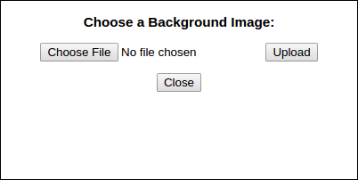
When you click the 'Upload Image' button, the following popup will appear:

A screenshot of the popup for uploading an image.

Each GUI page comes with a plain blue default background image, 'default.png'. If you would like to change this image to something else, such as a floor plan or schematic, you can do so in two steps:

  1. Upload the image to the server using the Upload Image popup.
  2. Edit the HTML file to use the new image. This is covered in Creating a New Page

To upload an image to the server, click the 'Upload Image' button. In the popup that opens, click the 'Choose File' button and select the image file you would like to make your new background image; .PNG, .JPG, .JPEG, and .gif image types are allowed. Once you have selected the image you want, press the 'Upload' button, and your images will be uploaded to the server in the same folder as the current page (public or private). A message containing the results of the upload will open in a new tab, which you can close without affecting the GUI page.

Custom Graphical User Interface | Vermont Energy Control Systems

Vermont Energy Control Systems

Practical monitoring and control for the real world

Widgets

A screenshot of several widgets

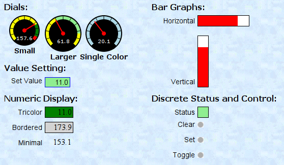
From here on, we will describe the details of appearance and behavior for each widget type. Some widgets are passive. These can only display a value. Others are active - they can also set an element value in the Vesta controller.

In each case, the first five required parameters are not discussed. They are covered in a previous section and are the same for all widget types.

For each widget type, one or more examples will be shown along with the corresponding specification.

Color Specifications

Most widgets allow colors to be specified. In those cases, any valid HTML color specification may be used.

Multicolor Widgets

An illustration of the colors displayed for each possible value

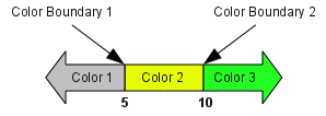
Many widgets can use multiple colors. In general, they all follow the same approach. If only a single color (Color 1) is specified, that color will be used - as the background color for a text widget, scale color for a dial widget, for example. For multi-color widgets, a 'color boundary' and second color value can be specified. In that case, if the displayed value is above the color boundary, the second color will be used for the widget background. In a similar way, a second boundary and third color can be specified.

In this example, three colors have been specified: lightgrey, yellow, and green. The two color boundaries have values of 5 and 10. That leads to the following behavior:

  • For display values up to 5, the background is light grey
  • For display values above 5 and up to 10, the background is yellow
  • For display values above 10, the background is green

Custom Graphical User Interface | Vermont Energy Control Systems

Vermont Energy Control Systems

Practical monitoring and control for the real world

Bar and Setbar Widgets

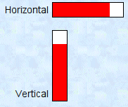
Screenshot of both vertical and horizontal bars screenshot of the code to create a bar bar widget in the menu bar vertical bar widget in the menu bar setbar widget in the menu bar vertical setbar in the menu bar

Both these widgets look the same and have the same parameters. The bar widget is passive and simply displays values graphically relative to a fixed minimum and maximum. The setbar widget will set the value of the associated data element to a value determined by where the bar is clicked. In both cases,there is no numeric value displayed. If a numeric value is desired, place a text widget adjacent to the bar or setbar widget.

Bar graphs have a specified height and width. If the width is greater than the height, then the bar graph is horizontal, increasing to the right. If the height is greater than the width, then the bar is displayed vertically with values increasing upwards.

There are four options for this type of widget in the Custom GUI menu bar: Bar, Vertical Bar, Setbar, and Vertical Setbar. The horizontal and vertical versions of each type of bar function identically, and you can convert an existing bar from one orientation to the other; these options are just for convenience.

Besides the normal five required parameters, the bar widget has seven additional parameters. The first five are required.

Parameter Value in Example Description If Not Present Default
Height 20 Bar height in pixels Required 20 (100 for vertical)
Width 100 Bar width in pixels Required 100 (20 for vertical)
Minimum 0 Minimum scale value Required 0
Maximum 200 Maximum scale value Required 100
Bar Color red Color for the bar Required Green (blue for setbar)
Background Colorwhite Color for the background TransparentLightgreen (lightblue for setbar)
Label Text Horizontal Label text to be displayed to left of widget No label Bar, Vertical Bar, Setbar, or Vertical Setbar

Custom Graphical User Interface | Vermont Energy Control Systems

Vermont Energy Control Systems

Practical monitoring and control for the real world

Text Widget

Screenshot of a text widget screenshot of the code to create a text widget text widget in the menu bar

The text widget is a passive widget. It displays a numeric value with one decimal place. It provides a choice of border style and color as well as up to three background colors. A label can be specified. If present, it will be scaled to approximately the same text height as the numeric value, and positioned to the left of the text widget.

By default, the text widget's border color is not set, and the color is determined by whether or not the text widget is successfully receiving data; the border is green when the data is being received correctly and red if not. You can override this feature by setting a border color for the text widget.

In addition to the five required parameters, a text widget has eight optional parameters:

Parameter Value in Example Description If Not Present Default
Color 1 lightgrey First color. Background color if additional colors are not specified Transparent Yellow
Border Style solid Can be any CSS border style, except 'Inset', which has special meaning for the 'Set' widgetNo border Solid
Border Color black Border color Black None
Color Boundary 1 5 Boundary value between displaying color 1 and color 2 Use color 1 33
Color 2 yellow Second color Use color 1 Green
Color Boundary 2 10 Boundary value between displaying color 2 and color 3. Use color 1 (or 2 if present) 66
Color 3 green Third color Use color 1 (or 2 if present) Red
Label Text Tricolor Label text to be displayed to left of widget No label Text

Custom Graphical User Interface | Vermont Energy Control Systems

Vermont Energy Control Systems

Practical monitoring and control for the real world

Light Widget

Screenshot of a light widget screenshot of the code to create a light widget light widget in the menu bar

The light widget is a passive widget that displays status for discrete (on/off) elements. By default it is rectangular in shape and can display user-selected colors for the on and off states.

In place of the default colored square, any image from the Vesta 'images' directory may be used for on and off states. Simply enter image URLs (such as /images/greendot30.png) in place of the color parameters. A list of available built-in images is available here.

Besides the normal five required parameters, the light widget has five additional parameters. The first four are required.

Parameter Value in Example Description If Not PresentDefault
Height 20 Height in pixels Required 20
Width 20 Width in pixels Required 20
Off Color or image lightgreen Color or URL for the 'off' state Required Grey
On Color or image green Color or URL for the 'on' state Required Yellow
Label Text Status Label text to be displayed to left of widget No label Light

Custom Graphical User Interface | Vermont Energy Control Systems

Vermont Energy Control Systems

Practical monitoring and control for the real world

Dial Widget

Screenshot of a dial screenshot of the code to create a dial dial widget in the menu bar

The dial widget displays the value of an element as a needle position and as a numeric value. The size of the dial can be specified. The dial scale can have up to three colors. Normally the height and width are the same, but dials can be made with the width greater than the height.

The dial widget has ten parameters. The first four are required.

Parameter Value in Example Description If Not Present Default
Height 72 Height of the dial face Required 85
Width 72 Width of the dial face Required 85
Minimum 50 Minimum scale value Required 0
Maximum 80 Maximum scale value Required 100
Color 1 yellow First scale color Transparent Yellow
Color Boundary 1 62 Boundary value between displaying color 1 and color 2 Use color 1 33
Color 2 lightgreen Second color Use color 1 Green
Color Boundary 2 75 Boundary value between displaying color 2 and color 3 Use color 1 (or 2 if present) 66
Color 3 yellow Third color Use color 1 (or 2 if present) Red
Label Text Larger Label text to be displayed below dial No label Dial

Custom Graphical User Interface | Vermont Energy Control Systems

Vermont Energy Control Systems

Practical monitoring and control for the real world

URL Widget

Screenshot of a url widget screenshot of the code to create a url widget URL widget in the menu bar

The URL widget is a passive widget that opens a link to a specified webpage when clicked. A URL widget can be either a rectangle with a text label or a specified image. If the URL widget is a rectangle, you can specify its background color, width, and height.

URLs are shown as rectangles by default, but you can set an image for a URL within the widget popup or the widget text file.

In addition to the five required parameters, a URL widget has ten optional parameters:

Parameter Value in Example Description If Not Present Default
Height 15 Height if a rectangle Fit to label text 20
Width 40 Width if a rectangle Fit to label text 40
Color lightgreen Background color if a rectangle Transparent Lightblue
Image URL of image if an image Displays as rectangle ""
URL /public/gaugepanel.htmlDestination of the link Current page ""
Target gwindow Target window for link to open in No effect gwindow
Label Position w Label position Top w
Label Text HOME Label text No label URL
Popup Width 1100 Width of popup window link opens in As small as possible 1000
Popup Height 650 Height of popup window link opens in As small as possible 500

Custom Graphical User Interface | Vermont Energy Control Systems

Vermont Energy Control Systems

Practical monitoring and control for the real world

Label Widget

Screenshot of a label screenshot of the code to create a label label widget in the menu bar

The label widget only serves to place text on the panel. It does not connect to an element and does not update. The size of the text can be specified.

Because the label widget does not connect to any element, the element field can contain any element number - the value is not used. The label widget has three additional parameters, all required.

Parameter Value in Example Description If Not Present Default
Font size 16 Height of font in pixels Required 20
Position e Position of label relative to specified coordinates n, e, s, or w for north, east, south, and west Required e
Label Text Dials Label text to be displayed to left of widget Required Label

Custom Graphical User Interface | Vermont Energy Control Systems

Vermont Energy Control Systems

Practical monitoring and control for the real world

Set Widget

Screenshot of a set widget Screenshot of a set widget in 'inset' style screenshot of the code to create a set widget set widget in the menu bar

The set widget is an active widget. In addition to displaying a numeric value, it allows that value to be set, sending the new value to the Vesta controller. It provides all the same options as the text widget, and is identical in appearance.

There are some special behaviors associated with the set widget. When it has focus (when you click on it) the border changes to the 'inset' style. This provides a visual clue that the widget is selected and ready for editing. While it is selected, it will not update. Once you're done entering data, tab (or press enter) to leave the field. The new data will be sent to the Vesta controller and the widget will update.

In addition to the five required parameters, a set widget has eight optional parameters:

Parameter Value in Example Description If Not Present Default
Color 1 lightgrey First color. Background color if additional colors are not specified Transparent Lightgrey
Border Style solid Can be any CSS border style, except 'Inset', because this widget uses the inset border to indicate focus No border Solid
Border Color blue Border color Black Black
Color Boundary 1 5 Boundary value between displaying color 1 and color 2 Use color 1 33
Color 2 yellow Second color Use color 1 Lightblue
Color Boundary 2 10 Boundary value between displaying color 2 and color 3. Use color 1 (or 2 if present) 66
Color 3 lightgreen Third color Use color 1 (or 2 if present) Blue
Label Text Set Value Label text to be displayed to left of widget No label Set

Custom Graphical User Interface | Vermont Energy Control Systems

Vermont Energy Control Systems

Practical monitoring and control for the real world

Toggle Widget

Screenshot of a toggle widget screenshot of the code to create a toggle widget toggle widget in the menu bar

The toggle widget is an active widget intended to be used with discrete (on/off) elements, but it will also work with analog variables. By default, it displays a red button if the element is true, and a grey button if the element is false.

In place of the default red and grey buttons, any image from the Vesta 'images' directory may be used for on and off states. Simply enter image URLs (such as /images/greendot30.png) in place of the color parameters. A list of available built-in images is available here.

In addition to displaying status, it allows the value of the linked element to be controlled.

There are three possible behaviors: Clear, Set, or Toggle. 'Clear' sets the Vesta element to false (or zero). 'Set' sets the element to true (or 1). 'Toggle' inverts the current value, changing true to false and vice versa.

If the element is changed by some other mechanism (such as a rule on the Vesta controller) the toggle widget will update to display the correct state.

Besides the normal five required parameters, the toggle widget has four additional parameters. The first is required - it specifies the desired behavior.

Parameter Value in Example Description If Not Present Default
Toggle Type2 Selects behaviors. 0=clear, 1=set, 2=toggle Required 2
Off Image [blank] Image to be displayed for 'Off' (false) condition Grey button ""
On Image [blank] Image to be displayed for 'On' (true) condition Red button ""
Label Text Toggle Label text to be displayed to left of widget No label Toggle