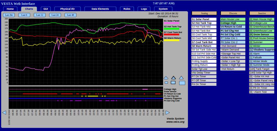
Charts Tab
This tab contains a charting tool that lets you explore logged data. This tool is still in development at this time, so all features may not work perfectly. Refreshing the page may solve some problems.
By default, it shows data for the past two hours. Analog values are plotted in two dimensions in the top portion of the chart. Discrete values are shown in the bottom section as lines that are thin when the discrete is off (false) and thick when it's on (true).

The buttons along the top let you look at the past 2, 6, 12, 24, or 48 hours with a single click. The blue arrows at either side of the timeline let you page forwards or backwards by one 'page'.
Clicking a start time and an end time on the timeline will zoom in to that interval.
Hovering over a trace key along the right side will highlight that trace. Clicking on a trace will remove it.
All data elements that changed during the displayed interval are shown immediately to the right of the chart. If an element is already displayed on the chart, it will be in bold. Clicking on an element will toggle it between being displayed and not being displayed.
Any data elements that did not change during the displayed interval are shown farther to the right. Each shows the value that it had during the chart display interval. They can be charted if desired, but since the value didn't change it will not be particularly interesting.
